Case study · Retail & food

Bakers Delight: a digital home for an Australian bakery favourite.

A new website for Bakers Delight that puts a huge product range within easy reach on any device, leading with the two things most visitors want: an ingredient list or the seasonal special.

Sector
Retail & food
Channels
Website
Website projectDigital experience
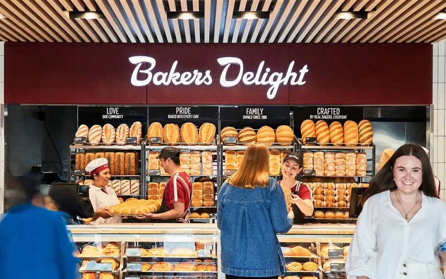
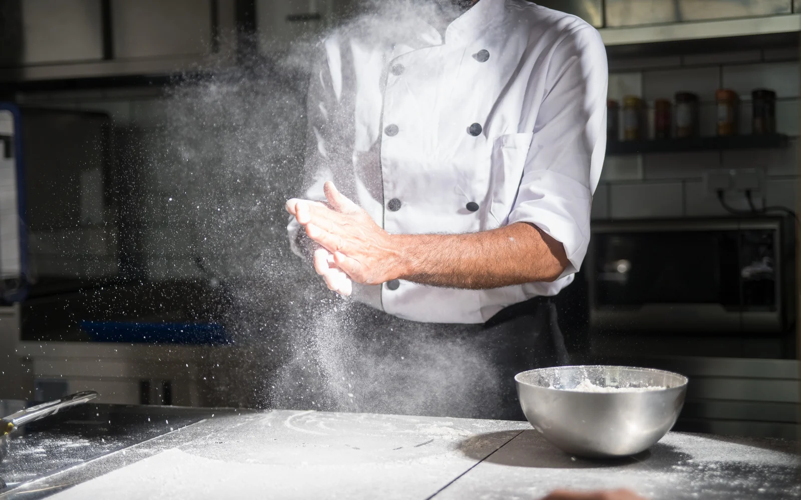
Baker preparing bread in a bakery.

The challenge

What needed to change.

Getting the right ingredients.

Bakers Delight had a huge range of products. We needed to make sure the new website had improved functionality and features that would be just as easy to use on desktop or mobile.

Creating a website that would look beautiful even on small devices was key. It had to be quick to load, easy to read and accessible no matter where you are, even if you are rushing out the door for Saturday sports.

Multigrain or wholemeal? We do not always know what we are looking for. That is why we needed to design a simple way to display Bakers Delight’s wide variety of baked goods.
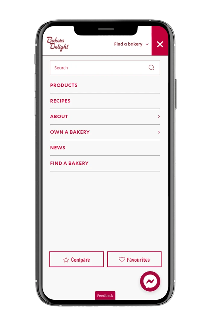
A module design with easily swappable segments would not only complement the friendly tone of the brand but also allow for seasonal promotions. We used this as the basis for transforming the website.

Bakers Delight had a massive range of goods on offer that needed to be sorted quickly into categories, and we did not want the customer to struggle to find what they were looking for. With more and more customers browsing on their phones, the mobile website also needed to work hand in hand with the desktop version.

We knew that adding a library of recipes would help promote the range by helping customers discover ways to use products as ingredients, and it added real value for visitors. And because Bakers Delight has seasonal and promotional items that are not available year round, items had to be easy to swap out without major changes to the website.

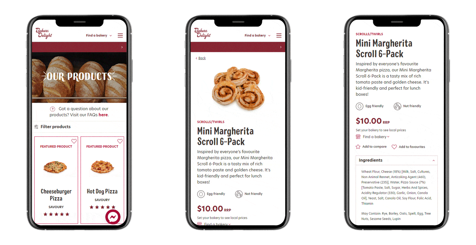
Bakers Delight search menu shown on a mobile phone.

Approach

How the work took shape.

Proofing the concept.

We started by considering the needs of the key demographic. Two reasons customers would visit the Bakers Delight website stood out: allergen and ingredient information, and seasonal products. We knew that making the website as visual as possible would improve ease of access, especially on mobile.

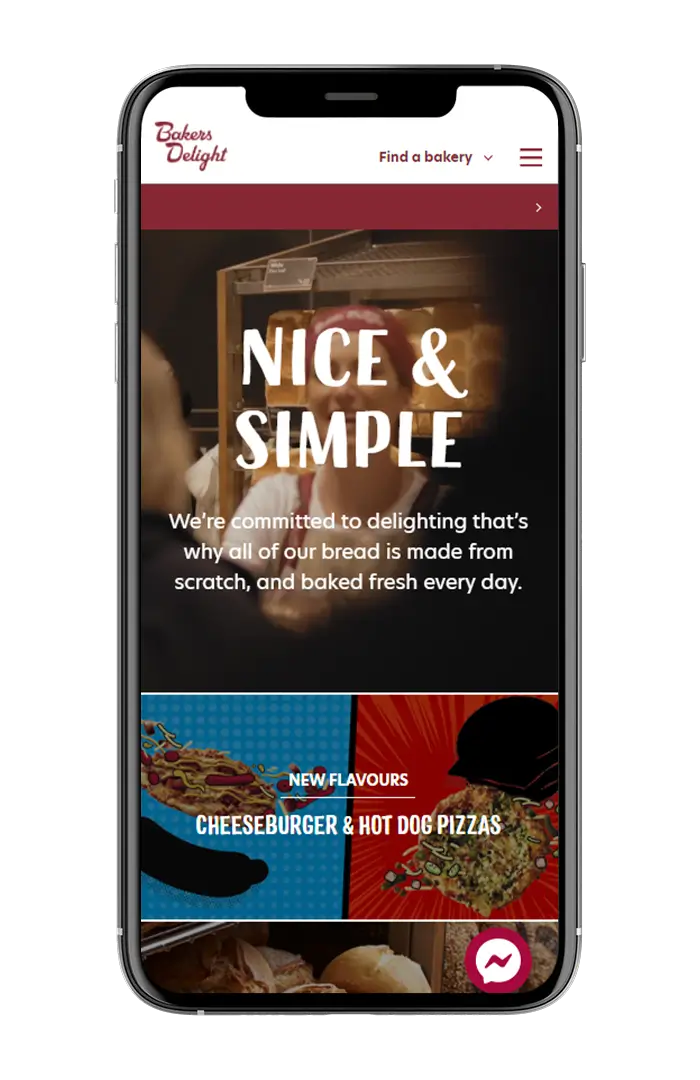
Nice and simple. Clear, visual information broken down into modules not only makes the website visually interesting, but helps ease of access.

Not just buns. The inclusion of a recipe tab not only adds visual interest to the website, but works in perfect conjunction with any promotional and seasonal campaigns. We have seen particular success with Back to School and Easter promotions.

Food friendly. Clear dietary information should never be hard to find. Customers can filter products by categories such as Low FODMAP, Vegan and nut friendly, then select an item to see every ingredient.

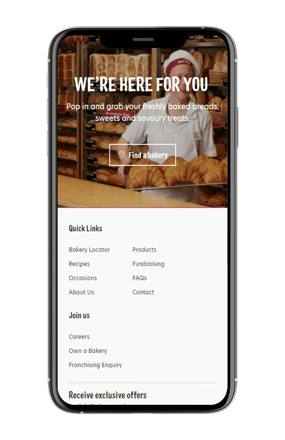
Mobile first. The final website works on any device without compromising its look and feel, and the location finder puts the nearest bakery a tap away.

Bakers Delight location finder shown on a mobile phone.

The shift

Most visitors want one of two things, an ingredient list or the seasonal special, so the website leads with both.

Talk to us

Planning a website like this? Talk it through with us.

Tell us what your project needs to do, and we will help identify the next step.

Continue the conversation

Bring the decision in front of you.

Proud partners

  • Google logo
  • Meta logo
  • Microsoft logo
  • Klaviyo logo
  • Mailchimp logo
  • WooCommerce logo
  • BigCommerce logo
  • WP Engine logo
  • Amazon Ads logo
  • Salesforce logo