Case study · Retail & food

RJN Vineyards: a crisp new website for Australian grapes.

RJN Cua Vineyards grows sweet, delicious grapes. With a major global fruit exhibition planned for the end of 2022, the team wanted new packaging, print collateral and a website that presented the business at its best.

Sector
Retail & food
Channels
Website
Website projectDigital experience
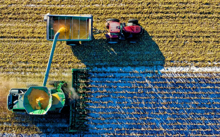
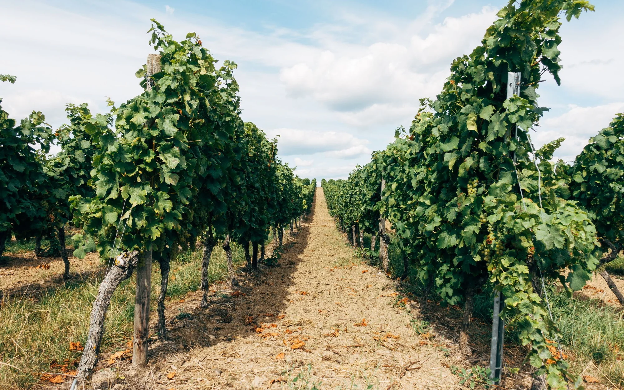
RJN Vineyards, mature vineyard rows.

The challenge

What needed to change.

RJN Cua Vineyards is a grower, and growing comes first. The team’s energy goes into the fruit, and for years the website had been left as it was while the business got on with the harvest.

That was fine until there was a reason to be seen. A global fruit exhibition put the vineyard in front of buyers from around the world, and the way the business presented itself online would be part of the impression it made. The website, the packaging and the print material all needed to look like they came from the same confident brand.
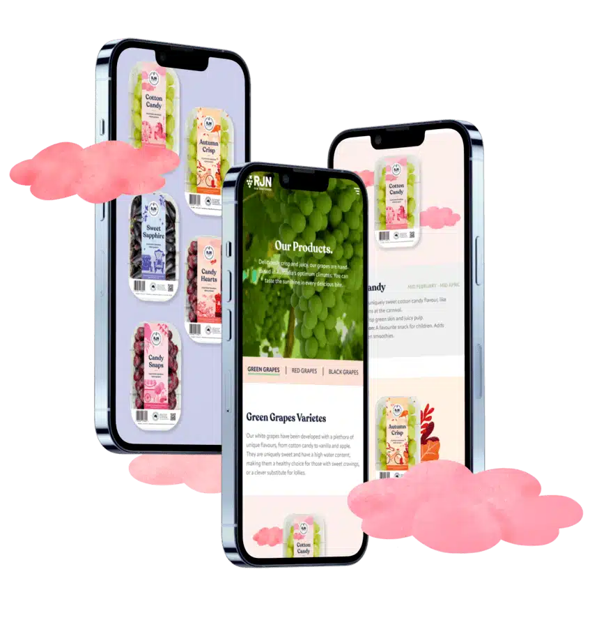
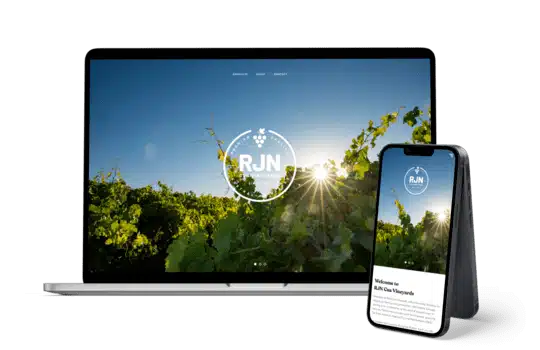
RJN Cua Vineyards had been focused on growing sweet, delicious grapes and had not turned its attention to its website for years. A major global fruit exhibition at the end of 2022 created the right moment to present the business at its best.

The digital presence needed to sit alongside new packaging and print collateral, giving the vineyard a consistent way to represent its grape varieties and Australia’s fresh fruit scene.

Approach

How the work took shape.

We treated the packaging, the print collateral and the website as one piece of brand work rather than three separate jobs, and we sequenced them deliberately. The packaging came first, because the supermarket shelf is where most people meet the grapes, and whatever worked there would set the direction for everything else.

Only once the visual language was settled did the website begin, so that the structure could be planned and approved before the design was applied to it.

We first worked with the team on new packaging designed to make the grapes stand out on supermarket shelves. Our designers created custom digital illustrations for selected varieties, while our copywriters developed tasting notes and serving suggestions for each one.

Once the UX designers had planned the new wireframe and the client had approved the structure, the branding and web teams brought the packaging style and newly developed print collateral online. The result was a new website built from the same visual direction.

RJN Cua Vineyards Website Mockup on Mobile View.

The shift

The packaging set the visual direction, and the website simply had to keep the promise the shelf made.

Talk to us

Planning a website like this? Talk it through with us.

Tell us what your project needs to do, and we will help identify the next step.

Proud partners

  • Google logo
  • Meta logo
  • Microsoft logo
  • Klaviyo logo
  • Mailchimp logo
  • WooCommerce logo
  • BigCommerce logo
  • WP Engine logo
  • Amazon Ads logo
  • Salesforce logo