Case study · Health & wellbeing

Evoca Health: an Australian-first women’s health initiative.

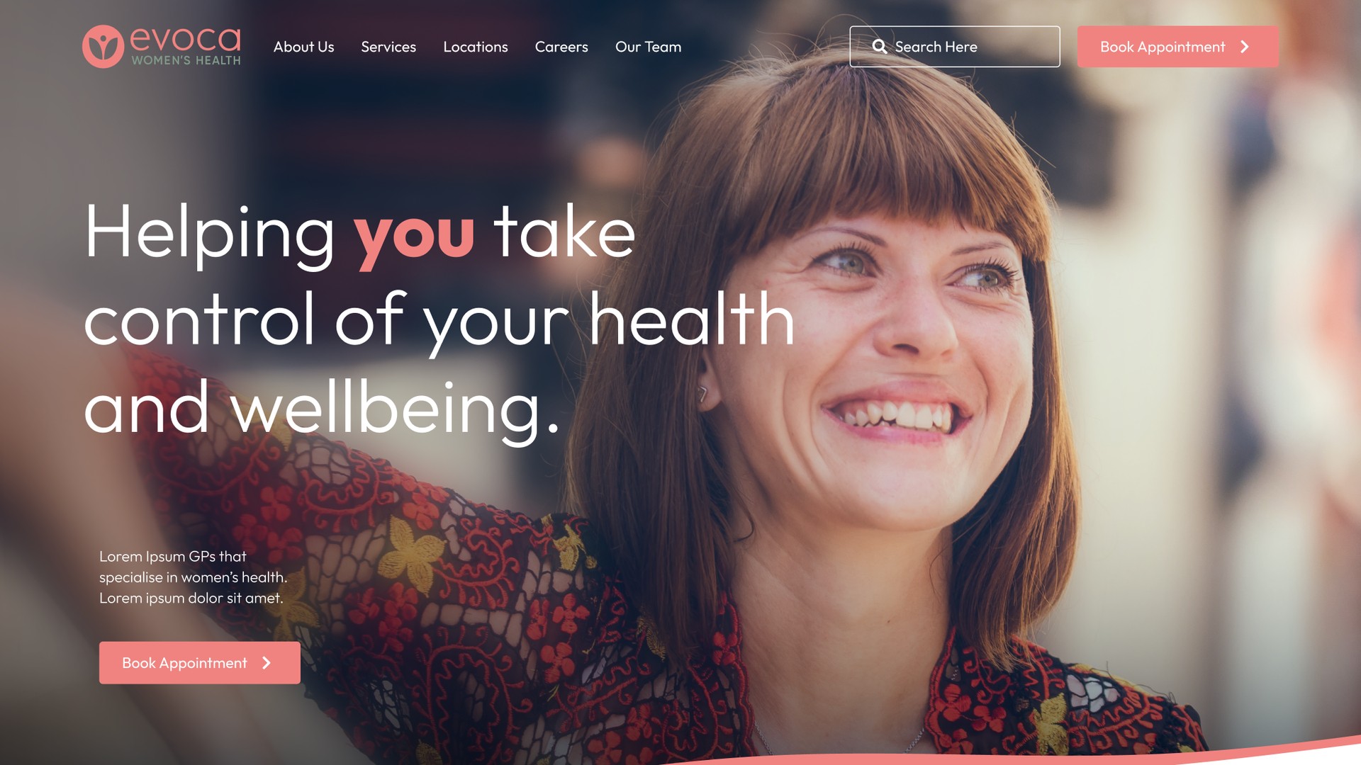
Evoca is a national network of women’s health GP clinics, with handpicked doctors offering individualised, evidence-based care. The new initiative needed a warm, welcoming website to spread the word and guide patients to a clinic near them.

Sector
Health & wellbeing
Channels
Website
Website projectDigital experience
Evoca Health, warm consultation portrait of two women from Evoca Health’s current website.

The challenge

What needed to change.

The Evoca network is the first of its kind in Australia: a group of women’s health GP clinics in all the major states, staffed by GPs chosen for their skill in individualised, evidence-based care. Between them the clinics cover every area of women’s health, from contraception, endometriosis, fertility and pregnancy through to menopause and everything in between.

As a new initiative, Evoca had no existing audience and no established brand to lean on. It needed a website that would introduce the network, build trust quickly and make it simple for a patient to find and book an Evoca clinic close to home.
Evoca Health group icons.

Approach

How the work took shape.

The big challenge was to make women’s healthcare more accessible and to provide a safe space for women to talk about their health. Evoca wanted to empower women through education, helping them take control of their own health, so the website had to inform as much as it directed.

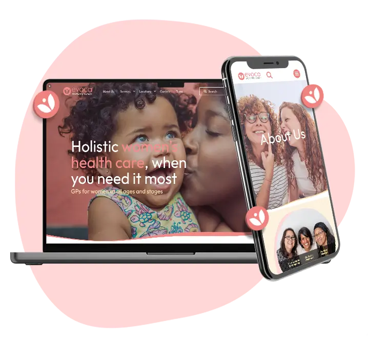
We set the tone first. Everything about the website, from the words to the pace of the animation, would be designed to feel organic, warm and approachable to women aged 17 to 45.

Several functions had to work together. A find a centre feature would connect women with GPs near them. The website had to build trust in a brand nobody had heard of yet by demonstrating the scale of the Evoca network, the experience of its GPs and practitioners, and how easy it is to access care.

Lead generation was a key requirement too, and it ran in two directions: new patients looking for a GP, and GPs interested in joining the Evoca network. Both journeys needed a clear path through the website.

Our UX designers mapped those journeys with interactive wireframes before any visual design began, so the structure could be tested and refined while it was still easy to change.

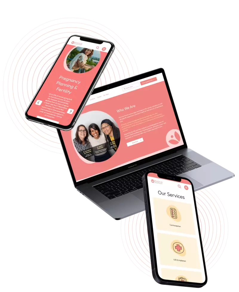
Evoca Health phone laptop evoca mockup.

The shift

Warmth was the brief, so every icon, transition and word had to make a nervous patient feel welcome.

Talk to us

Planning a website like this? Talk it through with us.

Tell us what your project needs to do, and we will help identify the next step.

Continue the conversation

Bring the decision in front of you.

Proud partners

  • Google logo
  • Meta logo
  • Microsoft logo
  • Klaviyo logo
  • Mailchimp logo
  • WooCommerce logo
  • BigCommerce logo
  • WP Engine logo
  • Amazon Ads logo
  • Salesforce logo