Case study · Retail & food

Haymes Paint: a vibrant new digital home for an Australian paint icon.

Haymes Paint has been made in Australia since 1935. When a period of rapid growth arrived, the brand needed a website that served retail customers, trade painters and specifiers equally well, and turned that engagement into sales.

Sector
Retail & food
Channels
Website
Website projectDigital experience
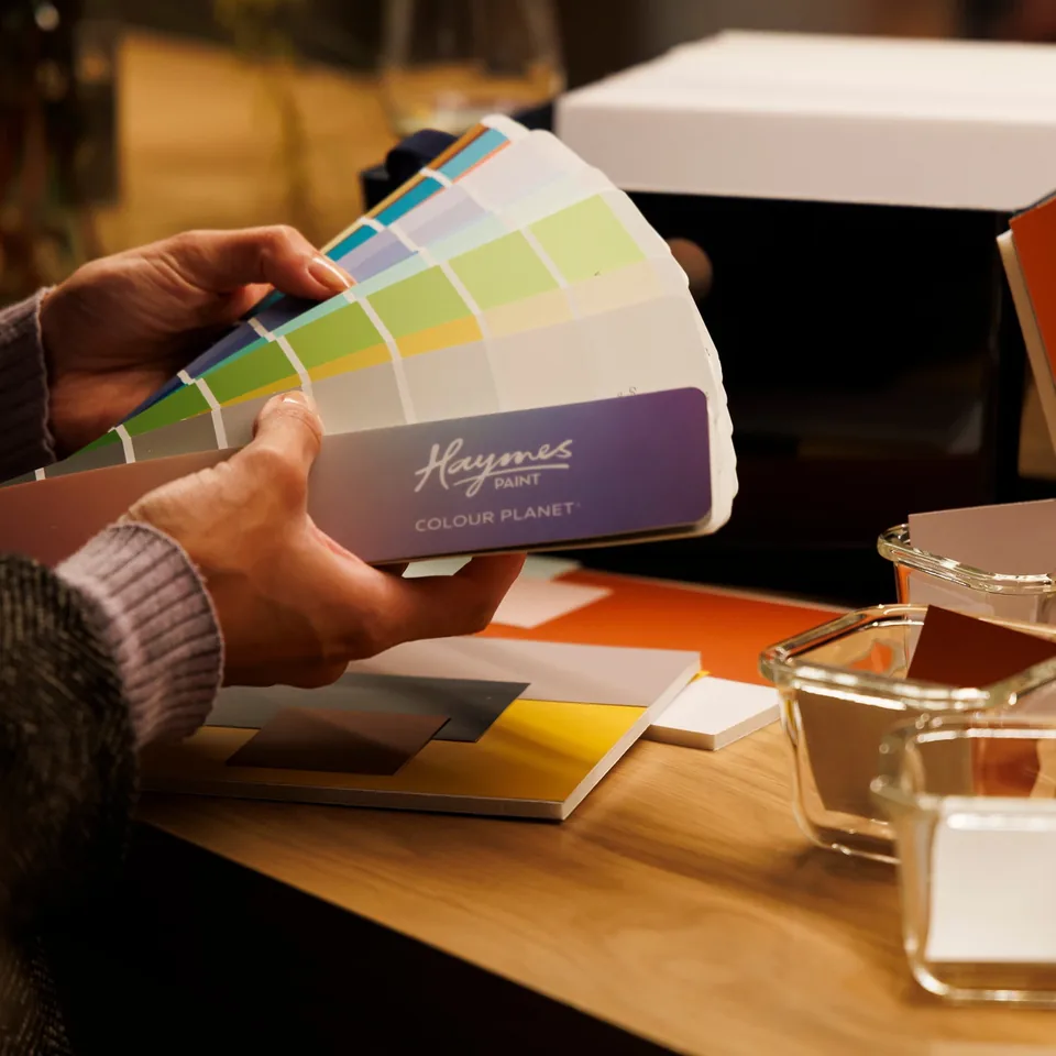
Hand holding a Haymes Paint colour swatch.

The challenge

What needed to change.

Haymes Paint is the country’s largest Australian owned and Australian made paint brand. In 2019/20 the company embarked on an ambitious growth strategy, establishing a franchise group, opening six new Melbourne metro stores and adding further store acquisitions and openings.

The multi-faceted website needed wide ranging changes to meet those growth targets. It had to serve retail customers, trade and specifiers, each with different needs, and it had to deliver better customer engagement and increased sales to match the new corporate ambitions. Giving a famous paint brand a new website design is a bold idea, and it needed to be done properly.
Approach

How the work took shape.

To meet the growth targets and make the user experience more enjoyable and efficient, we knew the changes had to be wide ranging rather than cosmetic. The first decision was about platform. To realise the new corporate ambitions, we scoped and defined a suitable customer engagement platform, and Oracle was the final choice.

The second decision was about people. The redesign had to consider each of the Haymes Paint customer segments, retail, trade and specifiers, so that every user experience was covered rather than designing for one and hoping the others followed.

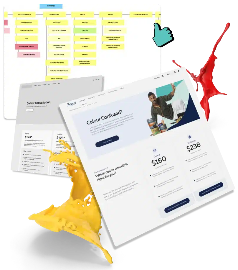
The realignment of the brand’s focus, and the energy behind it, was carried through every stage of the work: the information architecture, wireframe prototyping, the visual concept and the design itself.

Because the website runs on several Oracle modules, a great deal of the design effort went into making the transition between them feel like one continuous experience, so a customer moving from exploring colours to browsing products never senses a join.

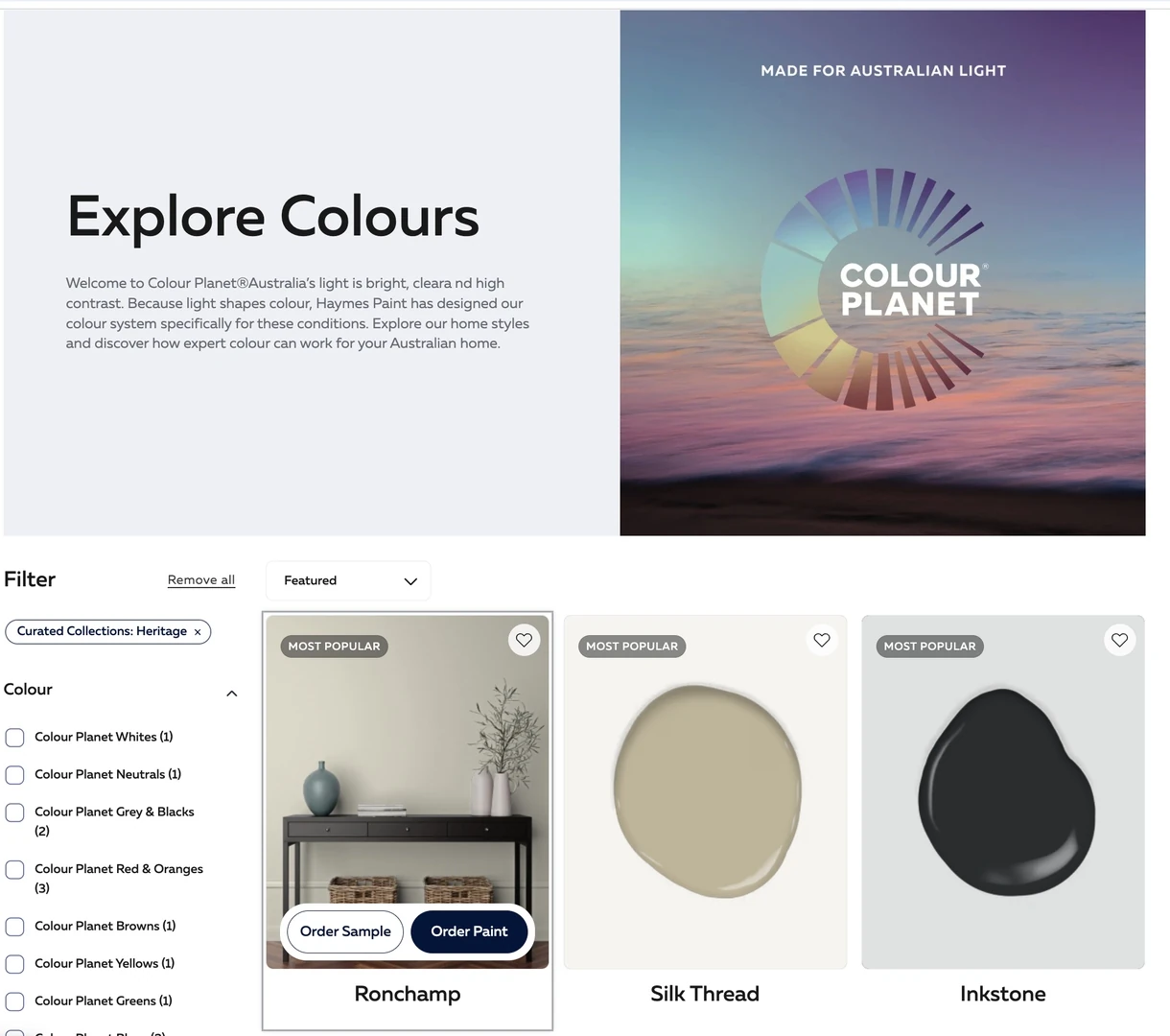
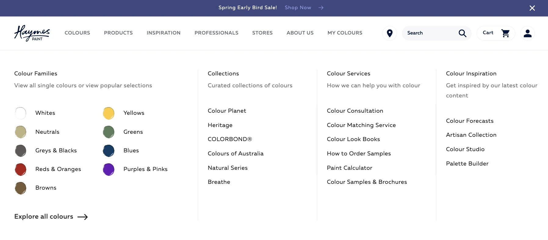
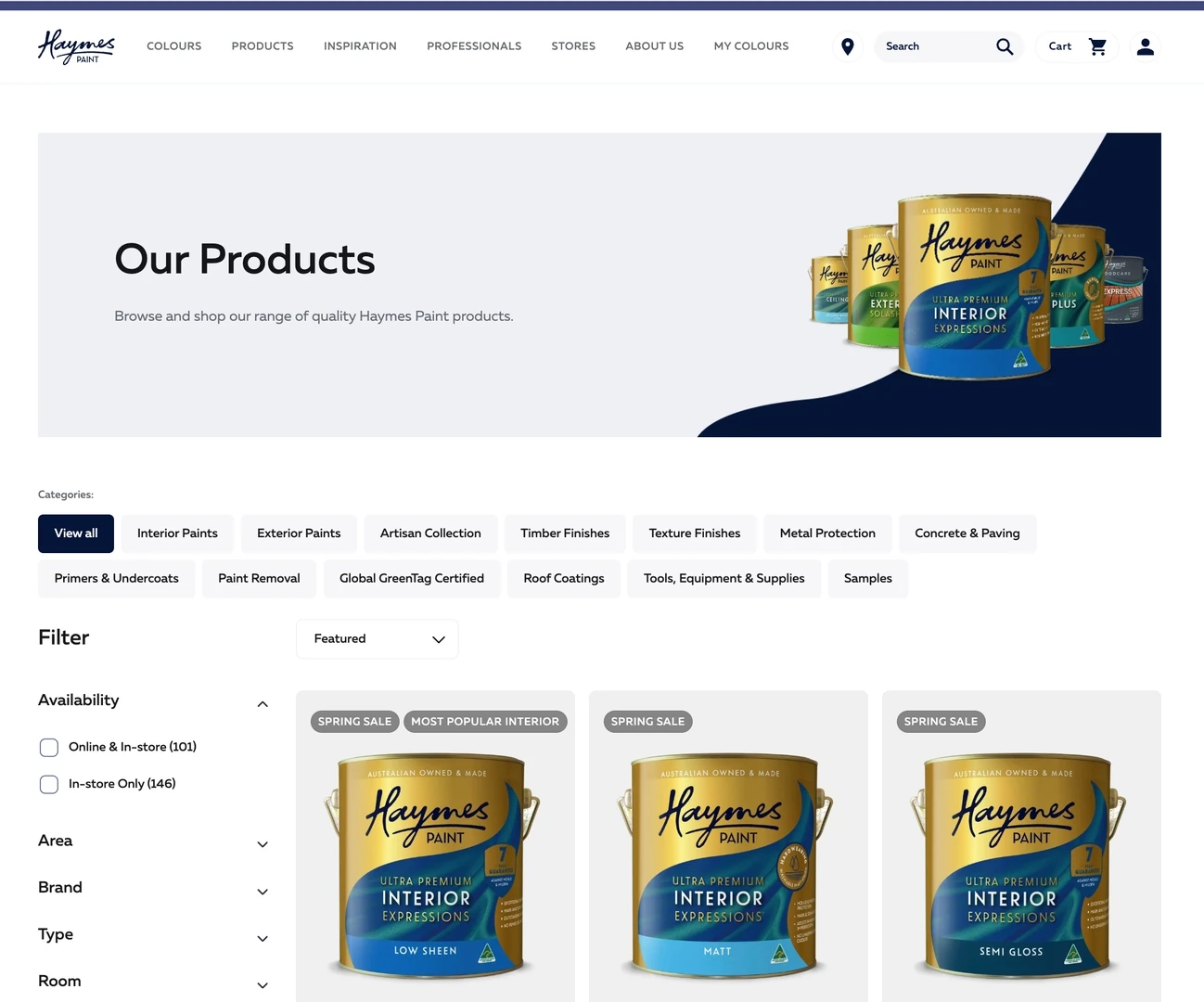
Colour is the heart of the brand, so the design gave it room. The colour exploration pages and the colours mega menu were treated as destinations in their own right rather than utilities, and every page was designed for desktop and mobile from the outset.

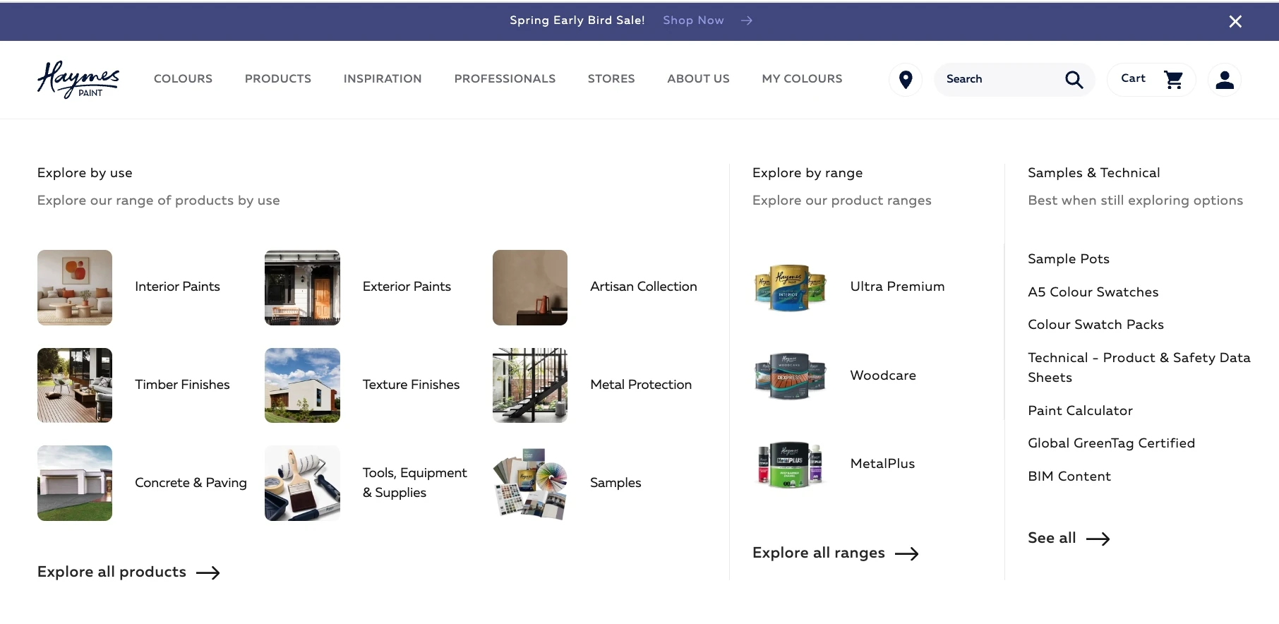
Haymes Paint pages designed for every device.

The shift

Designing for retail, trade and specifiers at once meant no customer had to work around the others.

Talk to us

Planning a website like this? Talk it through with us.

Tell us what your project needs to do, and we will help identify the next step.

Continue the conversation

Bring the decision in front of you.

Proud partners

  • Google logo
  • Meta logo
  • Microsoft logo
  • Klaviyo logo
  • Mailchimp logo
  • WooCommerce logo
  • BigCommerce logo
  • WP Engine logo
  • Amazon Ads logo
  • Salesforce logo